Creating accessible Word documents
Why should we care about creating accessible Word documents?
Our website governance policy commits us to creating accessible digital materials for all external-facing and student-facing content. (See the website accessibility standard.) Beyond that, digital access and educational access are human rights.
Creating accessible Word documents helps us honour human rights and meet University policy.
A great way to start is to use the Microsoft Word Accessibility Assistant.
Using the Accessibility Assistant in Microsoft Word
Microsoft Word's Accessibility Assistant runs in real-time in the background as you work on a Word document. This assistant reviews your document, and flags any accessibility errors or warnings as they arise and offers helpful accessibility tips.
- Errors: These Issues must be fixed for the document to reach basic accessibility.
- Warnings: These are issues you should improve. Though not as critical as an error, they should still be taken seriously.
- Tips: These are suggested improvements based on best practice.
You can find the Accessibility Assistant in the Review tab under Check Accessibility:
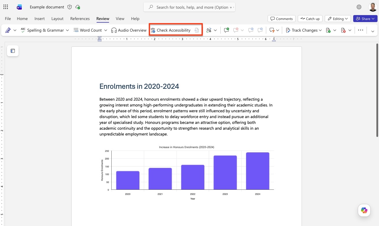
If you are using Word for Mac, a shortcut is to select Accessibility: Investigate under the tools menu.

Alt texts
What is an alt text?
Alt text is a short, written description of a non-text element such as an image, an icon, a chart, or a logo that conveys its meaning or function in the document. Screen readers announce this description in place of the image, so readers who cannot see the visual can still understand the content and purpose.
Many generative AI tools – such as Ally in the LMS or the University of Melbourne SparkAI tool – can create alt text drafts for you if you paste in an image. For detailed advice on writing alt texts, see the core accessibility skills guide.
Adding alt texts in Word Online
Open the Accessibility Assistant. To do this, click the Review tab, then click Check Accessibility.
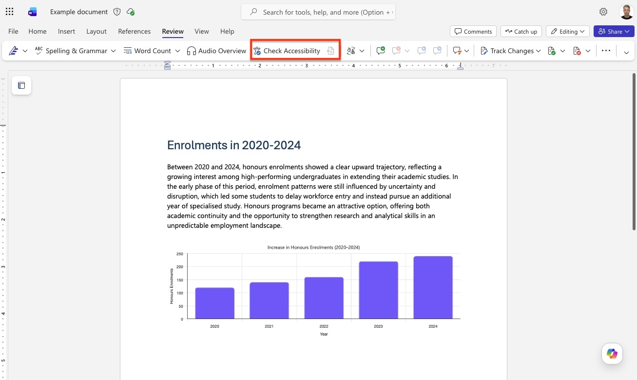
If you have images in your Word document that do not yet contain alt text, then these will be shown under ‘Errors’. To address these issues, click Missing alt text.
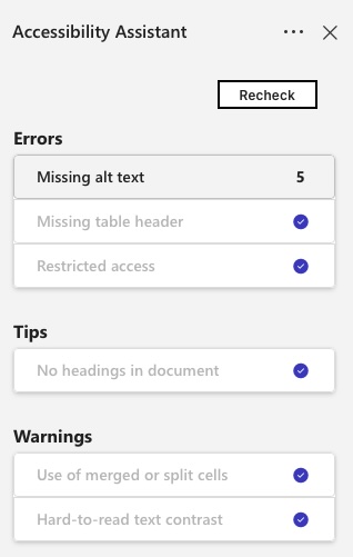
You can navigate through each issue using the back and forward buttons. To address each ‘missing alt text’ issue, click Alt Text.
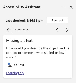
Under Alt Text, then add a concise, informative description of the image contents.
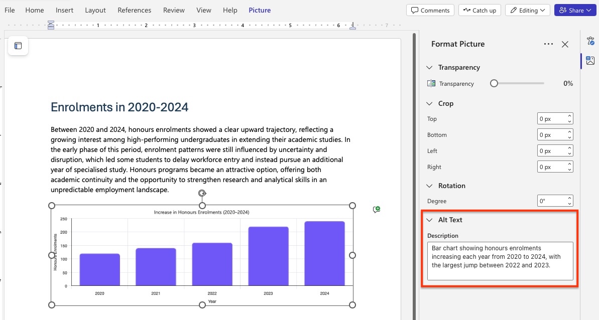
You can also access Alt text in Word Online by right clicking on an image, then select ‘Format picture’.
In Word Online, you cannot mark images as decorative, but you can in the desktop apps.
Adding alt text in the Word desktop app
To add alt text to an image or graph, right click the object and select View Alt Text.
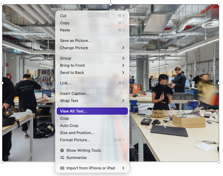
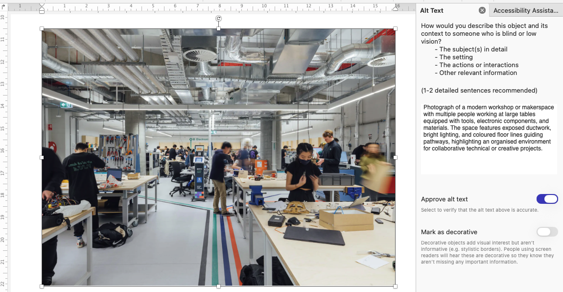
A panel will appear on the right where you can then enter the alt text. Alternatively, you can click ‘Generate alt text for me’ or ‘Mark as decorative’. If you ask Microsoft Word to generate alt text for you, it is important to read it carefully and make amendments where necessary. This tool uses AI to generate alt text so it may not accurately convey what you want to convey with the image or graph.
Once complete, toggle Approve alt text.
Headings
Using Word’s built‑in heading styles creates a clear structure for everyone and makes documents much easier to navigate with screen readers, keyboard shortcuts, and automated tables of contents.
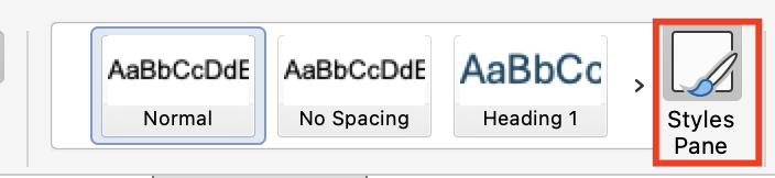
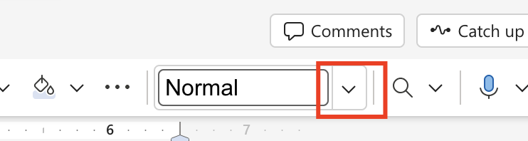
Use the Styles Pane to add headings. In all versions of Word (Windows, Mac, and Word Online), you can access a few styles in the Home tab.
You can expand the Styles Pane to view all available styles, and customise the look of styles, but this will look different for different versions of Word.
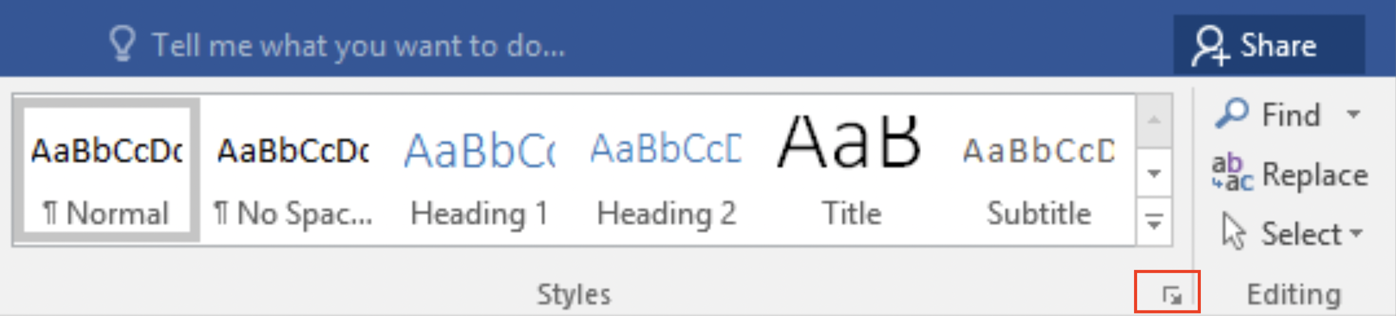
In Windows, you can click a small arrow in the corner of the style panel:
On a Mac, you can click the icon labelled Styles Pane:
In Word Online, the click the down arrow next to the 'Normal' style:
Don't like the look of a style? You can modify any style in the Styles Pane, or select other templates in the Design tab. For University of Melbourne documents, you can use the Word templates in the Staff Hub (login required). These templates will come with pre-styled headings.
Tips for headings
Do:
- Use heading levels to reflect the structure of the content.
- Keep headings brief and unique.
- For long documents, add a table of contents under the References tab > Table of Contents.
Don’t:
- Don’t use heading levels for decorative font style changes alone.
Example: headings
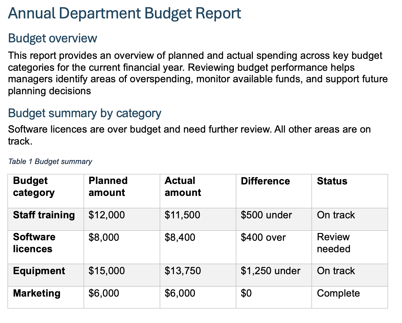
This example demonstrates a logical heading structure, where heading level 1 is used for the title ‘Annual department budget report’, heading level 2 is used for the heading ‘Budget overview’ and heading level 3 is used for the title ‘Budget summary by category’.
Lists
Use the in-built list functions to create bulleted lists and numbered lists.
Avoid multi-level lists where possible: they are tough to navigate with screen readers and Braille displays.
Tables
In Microsoft Word, you can modify the design of your table by using the options available in the ‘Table Design’ tab, or its layout in the ‘Table Layout’ tab. To make your table more accessible, make sure you have ‘Header Row’ and 'First column' selected as appropriate. This will help screen readers read these rows as headings of a table.
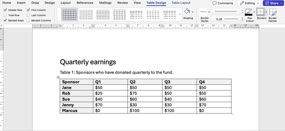
As a best practice, add a very short summary by right-clicking the table, selecting Table properties and then Alt text. A brief summary in the Title area suffices, and will let screen reader users know whether they wish to engage with the table cell by cell.
Tips for tables
Do:
- Do use tables for data, where the tabular format is meaningful.
- Do mark up Header Rows and First Columns.
- Do add a caption by right-clicking the table, and selecting Insert caption.
Don't:
- Don't use tables where a bullet list would do (for example, for a list of definitions).
- Don't use tables purely for layout purposes.
- Don't merge or split cells if you can avoid it.
Embedding video and audio
It is highly recommended you avoid embedding video and/or audio in a Word document and instead host this form of media in platforms that are more suitable for this type of media (for example, EchoVideo, which also lets you proofread captions).
Testing accessibility with the Immersive Reader
The Immersive Reader is a built-in Microsoft tool designed to simplify the reading experience and support readers' focus. Because the Immersive Reader simplifies content and presents it in a more accessible format, students with some learning differences (like dyslexia or ADHD) prefer to use it to display content.
Checking how your content displays in the Immersive Reader ensures they get access to the same content.
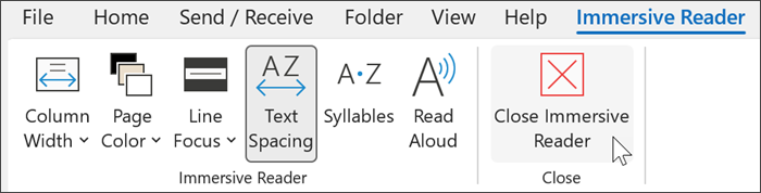
To open the Immersive Reader in Word Online:
- Select View.
- Select Immersive Reader.
Checklist: accessible Word documents
For all Word documents:
- Built-in heading styles are used consistently and in order without skipping levels.
- Built-in list styles are used to denote lists.
- Images and tables have alt texts summarising their content.
- Purely decorative images are marked as decorative.
- Tables are only used when necessary (for example, for tabular data).
- Tables have header rows and columns designated in the Table Design menu.
- Links use meaningful hyperlink text.
If you have control over the text formatting:
- Text uses accessible fonts, such as Georgia and Arial, and the text is a readable size like 11 or 12 point.
- Paragraphs have line spacing between 1.2 and 1.5, and there is extra space between paragraphs.
- Paragraphs are left-aligned rather than centred or 'justified’.
- There is high contrast between the font colour and the background colour.
The University of Melbourne brand templates (login required) default styles cover most of these formatting aspects.
The Accessibility Assistant can speed up this process.
Resources
General guidance
- Policy: University of Melbourne standards for web accessibility (University policy under MPF1392)
- Guide: Core accessibility skills
- Hub: Disability inclusion resources – links to resources for staff and students with disabilities, as well as accessibility information.