Core accessibility skills
Introduction
Whether you are creating content in the LMS, the website, SharePoint, Word, PowerPoint, or even Adobe, all digital materials need to be accessible. Creating accessible digital content from the start – rather than in response to specific requests – is part of how we create a university that benefits everyone, and eliminate disability discrimination.
Writing useful alt texts
‘Alt texts’ are brief text alternatives for digital images. Screen readers and refreshable Braille displays read alt texts to users in place of image files, and if an internet connection is interrupted, the browser displays alt texts to sighted users as well.
Many people feel hesitant writing alt texts at first, but there’s good news:
- You don’t have to describe every element of an image. In fact, concise alt texts are better.
- Machine learning tools and large language models can help speed up the process (if used thoughtfully).
- It’s normal to get better at writing alt texts over time, so it’s okay to start where you are.
Principles of writing alt texts
In general, alt texts should be:
- Concise: One long sentence or two short sentences.
- Informative: Images can convey a mood; describe a relationship, process or hierarchy; or replicate an elaborate formula. Pretend a friend is sitting opposite you, and tell them what the main subject is and what information you want them to get out of it.
- Description-focused: Only describe the information contained within the image itself. If the image needs a lengthy interpretation, explanation or analysis, that part doesn’t need to be in the alt text. Share it with everyone by writing the text on the page or delivering it verbally in a presentation.
- Light on punctuation: End the alt text with a full stop. You can use commas and full stops, but screen readers vary on support for other punctuation and special characters. It’s best to minimise them.
You do not need to write “image of”, because screen readers announce when they are reading an image.
What to include for different types of visuals
- Photographs: Identify the subject, relevant action, setting and any details needed for the learning purpose. Do not describe irrelevant appearance details.
- Screenshots: Explain what the screenshot shows and why it is included. If the user needs to follow steps, provide the steps in body text rather than relying on the screenshot alone.
- Charts and graphs: State the chart type only if useful, then summarise the main trend, comparison or takeaway. If precise values matter, provide them in text or a table.
- Diagrams and flowcharts: Describe the starting point, sequence, relationships and endpoint. For complex diagrams, provide a full text alternative.
- Infographics: Do not cram all infographic content into alt text. Provide a short identifier in alt text and a nearby text alternative that communicates the same information.
- Formulas, equations and notation: If the equation is essential, provide it in an accessible equation format where possible. If it must be an image, write a clear text version or provide the equation in surrounding text.
- Icons and buttons: Describe the function, not the appearance. For example, “Submit response” is usually better than “Blue arrow icon”.
- Logos: Identify the organisation or brand if it communicates useful information. Decorative or repeated logos may be marked as decorative depending on context.
Lengthy or complex images
If you need more than 1-2 sentences to adequately convey the information, provide a full text alternative. In many formats, you can contain a text alternative in an accordion or similar so that users can choose whether to view it.
Use the alt text to describe the location of the text alternative.
Example: “This is figure 1. To read the text alternative, open the link following this image.”
Marking images as decorative
If an image does not convey any meaningful information at all, it’s okay to mark it as decorative. A perfect example is a decorative ‘ribbon’ at the top or bottom of a page – one with no text or logos.
Most platforms have a tick box to allow you to “mark as decorative”. If you work directly in HTML code, you can add a null alt attribute; that is, alt=””.
Examples: Improving alt text
Photograph of students in a laboratory

- Poor: “Students.”
- Better: “Students work at benches in a university laboratory with equipment and notebooks.”
Screenshot of a Canvas discussion page
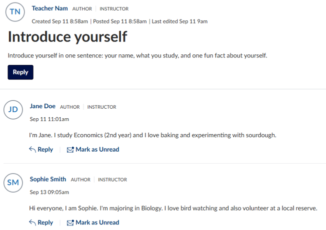
- Poor: “Screenshot.”
- Better: “Canvas discussion page showing a discussion prompt above a list of student replies.”
Line graph in a lecture slide
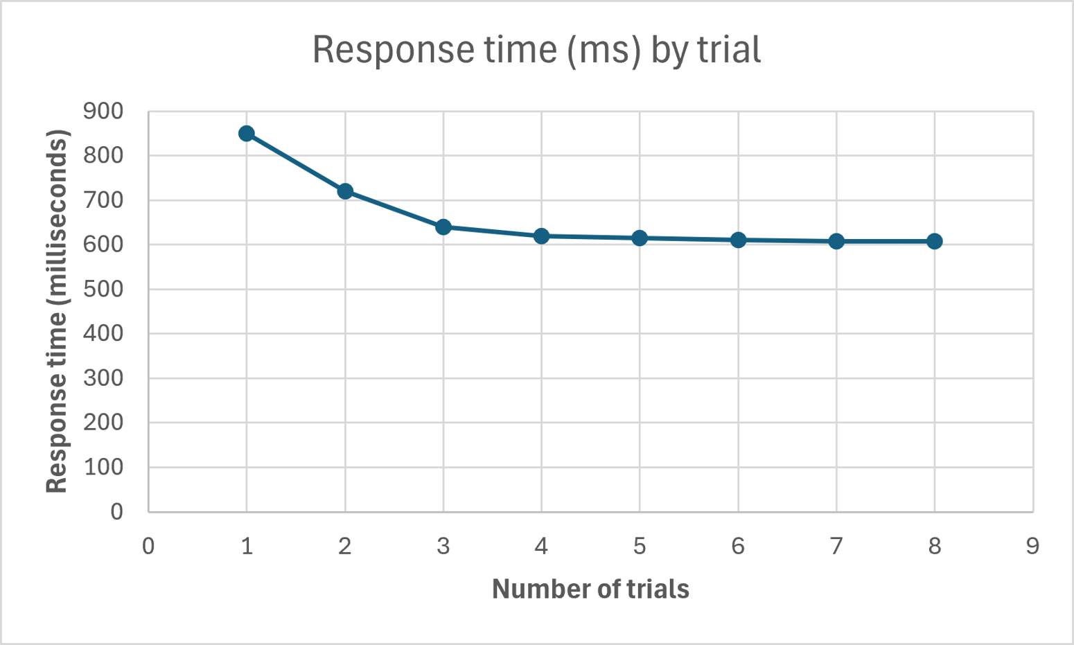
- Poor: “Line graph of results.”
- Better: “Line graph showing response times decreasing across the first three trials, then levelling off from trial four.”
Decorative banner

- Poor: “Blue abstract banner.”
- Better: Mark as decorative.
Image that contains text
Where possible, avoid images of text, and type or paste the text directly instead. In some cases, a picture of text might be unavoidable; for example if you need a photograph of a printed item
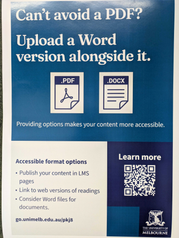
- Poor: “Poster with text.”
- Better: Use a short alt text like “PDF poster. Full text follows.” Then recreate the text in the document, following the image. In a webpage, this text can easily be hidden in an accordion panel.
Writing alt texts for assessments
Yes, it is still necessary to write alt texts for images in assessments and exams.
There is an art to it – you need to convey the essential features of the visual cues without giving away the information you are asking students for. Here again, pretend you are describing an image to a colleague sitting across from you. If you wanted them to be able to answer the question, what information would you need to tell them?
Examples: alt texts for assessments
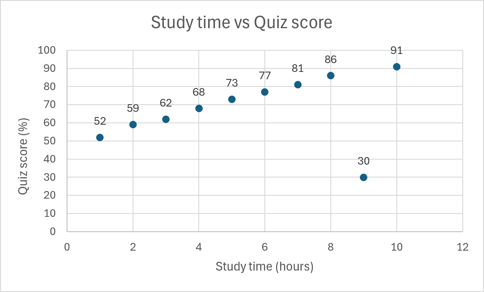
Asking students to interpret a graph
Your question might ask students to explain what a graph means, or what actions should be taken based on the data. In that case, students will need access to the general trend, but not the interpretation or the data. A possible alt text would be: “Scatter plot with study time on the x-axis and quiz score on the y-axis. The points generally rise from left to right, with one low-score point at high study time.”
If your question asks a mathematical question based on the data, you may wish to provide a table as an alternative – just be sure the table is in a text format and has row and column headers.
Visual diagnoses
If you are asking students to make a visual diagnosis based on an image, students will needs access to the relevant visual features. A possible alt text would be: “Close-up photograph of a skin lesion on the forearm. The lesion is oval, dark brown and unevenly coloured, with an irregular border.” You may choose to include distracting information as well, such as the surrounding skin colour if that is irrelevant.
Of course, it is rare that students using screen readers will be taking a subject that requires, but it can and does happen – students can operate with restrictions on their practising certificate. Furthermore, if the image fails to load in the test environment, the alt text is the only thing that any student will see.

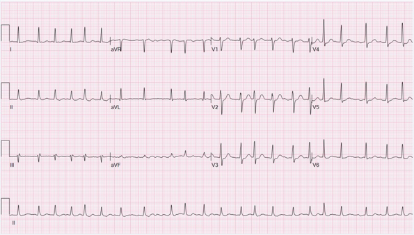
You might ask students to interpret a medical graph. For example, you could be asking students whether this is a normal rhythm, atrial fibrillation, myocardial infarction, or something else. An alt text then describes the relevant visual features, but not the diagnosis. This alt text could be: “Twelve-lead ECG showing an irregular heart rhythm, with uneven spacing between heartbeat peaks and varying intervals across the tracing.”
Using AI-generated alt text responsibly
Many generative AI tools – such as Ally in the LMS or the University of Melbourne SparkAI tool – can create alt text drafts for you if you paste in an image. AI-generated alt text can be useful as a starting point, especially when reviewing many images. It still needs human review because it may miss the educational purpose of the visual, omit important details, overstate what is visible, or introduce inaccurate information.
- Always review generated alt text before approving it.
- Check that it describes the image in the context of the surrounding content.
- Remove confidence statements or system-generated comments from the alt text field.
- For assessment images, do not rely on AI-generated alt text without subject matter review.
Generative AI alt text rules
You can ask most generative AIs to remember rules about creating good alt texts. This is a sample you can start with.
Please follow these rules for alt texts:
- Be concise. The goal is 120 characters, though you may need to go slightly over.
- Do not write "image of" or "photograph of".
- Describe the most prominent visual components.
- Avoid interpretation, diagnosis or conclusions.
- Do not include sensitive, speculative or irrelevant details about the people in images.
- If you have a slide or a document, write an alt text that is relevant to the context of the document.
- Use commas and full stops for readability.
- Avoid complicated punctuation.
- Avoid subscript and superscript notation, using words such as "sub" and "to the power of" instead.
Review checklist for alt text
- Every meaningful visual has alt text or an equivalent text alternative.
- Decorative visuals are marked as decorative rather than given unnecessary descriptions.
- Alt text is concise, accurate and relevant to the learning or communication purpose.
- Charts, diagrams and infographics have a full text alternative when the alt text field is not enough.
- Assessment alt text gives access to the visual information without giving away the answer.
- AI-generated alt text has been reviewed, edited and approved by a person.
Creating accessible tables
Only use tables if you need to
The first rule: Don’t use a table unless you have to. Ask yourself if the material must be in a tabular format, such as a data table, the periodic table, or a risk management matrix. Alternatively, is it a list (like a list of terms and definitions)? Tables are tough to navigate with smaller screens and with assistive tech, so if the material can be laid out with subheadings or a list instead, it's more accessible to lay it out that way.
Give users a quick preview of what's in the table
When you have to use a table, it's worthwhile remembering that tables are tough to navigate, so you need to give users a quick overview of what the table is.
Depending on the format, you might be able to add an alt text attribute, or you might have to settle for a caption above the table.
Make it easy to navigate the table
Assistive technologies depend on properly marked up header rows and columns to tell users where they are, so no matter what format you're working in, be sure to use proper heading styles.
Merged cells make navigation very tough, so avoid them wherever possible. Sometimes people use header rows to contain a table caption, but that’s not necessary – it’s better for the caption to appear in text.
Examples: Tables
A table that could have been a list
Tables are difficult to navigate with assistive technology, and hard to zoom in on. This table is really just two lists:
| Benefits for students | Benefits for educators |
|---|---|
|
|
Instead, you can use a bulleted list, like this:
Benefits of ePortolios for students include:
- Developing skills in critical thinking and reflective practice through purposeful reflection on goals, skills and evidence of learning
- Promoting development of professional identity through collection and curation of evidence of professional practice
- Showcasing students’ creativity by giving flexibility to express their personality through different media
Benefits for educators include:
- Adding industry-related skills to the curriculum
- Supporting choice, flexibility and multimodality in assessment
- Providing opportunities for formative feedback.
A table with merged cells
Tables like this can a bit tough for anyone to navigate, but for users of assistive technology, it's particularly tough.
| Saturday | |||
|---|---|---|---|
| Stream A | Stream B | Stream C | |
| 10am | Drawing with charcoal | Sculpting clay | Collage as an art form |
| 12pm | Lunch | ||
| 1pm | Painting with water colour | Pottery wheel | Sculpting with found materials and objects |
| 3pm | Painting with acrylic | Polymer clay workshop | Integrating art in the environment |
| Sunday | |||
| It is best to stick to one stream continuously today, but you may switch. | |||
| 10am | Vocal warm-ups and basic exercises | Warm-up acting exercises | Warm-up dance exercises |
| 12pm | Lunch | ||
| 1pm | Choir singing and matching pitch | Comparing different acting styles | Exploring ballet studio exercises |
| 3pm | Expanding vocal range | Giving and receiving feedback on performance | Exploring swing dancing |
| See our accessibility document for the range of abilities needed for each class and the accommodations available. | |||
Instead, try breaking up the table.
Lunch will be at 12pm each day in the Atrium.
See our accessibility document for the range of abilities needed for each class and the accommodations available.
| Stream A | Stream B | Stream C | |
|---|---|---|---|
| 10am | Drawing with charcoal | Sculpting clay | Collage as an art form |
| 1pm | Painting with water colour | Pottery wheel | Sculpting with found materials and objects |
| 3pm | Painting with acrylic | Polymer clay workshop | Integrating art in the environment |
On Sunday, it is best to stick with one stream for the day, but you may switch.
| Stream A | Stream B | Stream C | |
|---|---|---|---|
| 10am | Vocal warm-ups and basic exercises | Warm-up acting exercises | Warm-up dance exercises |
| 1pm | Choir singing and matching pitch | Comparing different acting styles | Exploring ballet studio exercises |
| 3pm | Expanding vocal range | Giving and receiving feedback on performance | Exploring swing dancing |
An accessible table
This table is accessible, because it has:
- A table caption the provides the overall topic of the table
- Row and column headers that use in-built heading styles
- No merged cells.
| City | Temperature (°C) | Conditions | Precipitation (mm) |
|---|---|---|---|
| Melbourne | 18 | Possible showers | 2 |
| Sydney | 22 | Sunny | 0 |
| Brisbane | 24 | Mostly sunny | 0 |
| Hobart | 15 | Light showers | 3 |
Using colour in an accessible way
Accessible pages can still use colour! The two important factors are:
- Keep high contrast between font colours and the background, and
- If you use colour coding, use something else (like symbols or patterns) as well.
Colour contrast
Strong contrast between fonts and background colours is valuable for people with low vision as well as people with colour blindness. A very dark colour (like the University of Melbourne Heritage blue) against a very pale background will be fine. White screens can sometimes trigger migraine sufferers, so picking a pale background just off white can take the edge off.
If you want to try out other font colours for any reason, try a colour contrast tool like the browser-based WebAIM Contrast Checker, or the software tool Colour Contrast Analyser. If you aim for a contrast ratio of 7:1, your content be readable by almost everyone with vision.
Redundant coding with colour
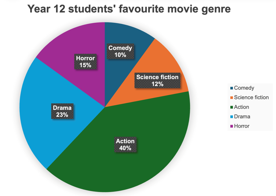
Graphs often colour-code data – that is, they use colour to indicate meaning. If you think about it, so do traffic lights and board game pieces! However, there is no colour combination so accessible that every person can distinguish between them.
For that reason, whenever you use colour to indicate meaning in a graph, map or other visualisation, you need to add either text, or a pattern, or a symbol. For example:
Creating accessible headings
Accessible headings are:
- Concise
- Descriptive
- Created with built-in heading styles.
Some people navigate pages by scanning through headings, so the heading needs to signal what's in a section without running on too long.
Headings need to be created with heading styles in LMS pages, websites, LaTeX or Word documents. Start with the highest-available heading level, and don't skip heading levels – this lets users navigate comfortably by headings. If you need to, you can adjust the visual styling of heading styles, but it's important that a Heading 1 is always followed by a Heading 2 and so on.
PowerPoint doesn't use heading styles; the slide title is the closest parallel. Unique slide titles, therefore, are essential in PowerPoint slides.
Formatting text accessibly
Fonts
If you don't want to learn the details of accessible fonts, be reassured that the University of Melbourne brand fonts (Arial with Georgia for headings) are accessible. If you're in a situation of choosing which fonts to use (outside of branded material), Calibri, Verdana and Tahoma are also safe bets.
For those who are interested in the details: the characteristics that make some fonts more accessible than others are complex, and preferences do vary. That's one of the reasons it's best to provide content in the LMS, HTML, or editable documents – users can adjust fonts and sizes to suit their needs. There are some general guidelines for accessible font characteristics, though, which Vision Australia summed up beautifully in its two-part blog series:
- Typography in Inclusive Design Part 1: 8 key tips for accessible typography
- Typography in Inclusive Design Part 2: Choosing typefaces and laying out text content.
Paragraphs
The layout of paragraphs and pages can present barriers to users with dyslexia, as well as users with visual impairments. While formats like HTML allow users to customise layouts to a degree, it is still important to make content readable in digital and physical formats. Accessible paragraphs are:
- Left-aligned (rather than centred or justified)
- Generous with line spacing – 1.2-1.5 lines for most paragraph text
- Generous with paragraph spacing – about 1.5 times the height of line spacing.
Layouts
Clean, straightforward layouts are beneficial for:
- Many people with autism and/or ADHD
- Many people with dyslexia
- People using assistive technologies like screen readers and Braille displays
- People using mobile devices and tablets.
In short, keeping your digital and print media designs simple is beneficial for almost everyone.
You don't have to avoid all layout elements, but consider the difference between the Google search interface and a busy pop-up ad. Using fewer pull-out text boxes and a small number of strategically chosen images will maximise the impact of each element, and make your material easier to read.
Creating accessible links
Accessible links are:
- Concise
- Descriptive
- Unique on the page or in the document.
Some users navigate pages by tabbing through links, with assistive technology reading out only the text that is hyperlinked.
Ask yourself if a user can tell where the link goes by reading the linked text alone. A page full of links that say "more information" or "click here" doesn't enable users to navigate this way. A page or slide containing lengthy web addresses forces users to listen to lengthy strings of numbers and letters that don't tell them where they're going.
If you link to a file (as opposed to a webpage or LMS page), indicate the file type in brackets as shown in the example. This saves users time in downloading and opening files in formats they can’t access.
Examples: Accessible hyperlinks
Inaccessible links:
- Check out a video of penguins socialising here.
- Check out this video of penguins socialising: https://youtu.be/k22Gg13ahDc?si=WPDm2XBNpBcQ4FZY
- Biggs, J., Tang, C., & Kennedy, G. (2022). Teaching for Quality Learning at University (5th ed.). McGraw-Hill: Open University Press. https://www.mheducation.com.au/teaching-for-quality-learning-at-university-5e-9780335250820-aus-group
Accessible links:
- Watch this video of penguins socialising.
- Biggs, J., Tang, C., & Kennedy, G. (2022). Teaching for Quality Learning at University (5th ed.). McGraw-Hill: Open University Press. https://www.mheducation.com.au/teaching-for-quality-learning-at-university-5e-9780335250820-aus
Tip
If you regularly paste in references with DOI or URL addresses, it can be frustrating to manually remove hyperlinks.
You can change settings in Word, PowerPoint and Outlook to turn off automatic hyperlinks. Typically, the setting is under Options > AutoFormat as you type.
With print material, users cannot use assistive software (such as screen readers), so it would be easy to make the mistake that ‘accessibility does not apply’. However, some of the skills above – such as using accessible fonts, text alignment, and colour – apply equally in print. To maximise access, there are also guidelines for minimum font sizes, and ways to make web addresses easier to use.
Font size for print materials
A minimum for print materials is 12 point for regular text, and 18 point for large-print text.
For posters, however, consider the increased distance between the reader and the material. To read comfortably from a greater distance, users typically need:
- 32 point font for body text
- 44 point for headings
- 72 point for titles.
Paper
Matte finishes are easier to read from than glossy finishes.
Providing QR codes and links
Lengthy URLs can be difficult to type manually, and difficult for some people to see. Provide a short link in a large, easy-to-read font, and pair it with a QR code where possible. QR codes can be particularly valuable for people with low vision, who can visually discern that a code is present but may struggle to read a link. Short links are valuable for people without a QR-code-ready device at hand, or who struggle to use the technology.
Checklist for print materials
- Follow the guidance for accessible colour use.
- Follow the guidance for accessible fonts.
- Use left-aligned text for paragraphs.
- Use a minimum of 12-point font for body text (24 point recommended for posters)
- Keep layouts clean and minimal wherever possible.
- Pair QR codes with short links.
If you provide a digital version of printed material, create the item in HTML rather than sharing an image or PDF file. (This is applicable for text material, but not for purely visual media such as photographs, which can be shared as images with alt texts.)
Video
Most videos assume that users can both see and hear the content, but that's a faulty assumption. It is important to:
- Provide options for people who are Deaf or have hearing impairments
- Provide options for people who have vision impairments
- Allow users to control the media
- Avoid flickering or flashing elements.
Supporting hearing in videos
The essential here is to provide accurate, synchronised closed captions. Automated caption tools built on natural language processing are powerful, and speed this up quite a bit, but they usually need proofreading to be valuable. Incorrect captions can cause significant confusion.
Pay particular attention to terms like names of Country, where misspellings can undercut the respect shown in the recording.
Proper captions also include hesitation words ("um", "uh" and so on), indicators of music or other sounds, and replicate any words spoken that aren't written on the screen, such as an off-screen speaker.
Transcripts are a wonderful additional format, especially when made available via in accessible formats like RTF or HTML. For a Deafblind person, a descriptive transcript in HTML or RTF is the only way they can access content.
Supporting vision in videos
One alternative is to provide an audio-description track for the audio, and allow users to toggle it on and off. (Think about the way you can toggle some videos into different languages.) Audio descriptions explain orally what is happening on the screen visually, including the subjects on screen, words on screen, and any visual jokes.
A streamlined alternative for everyday recordings is to describe what's happening visually as you record the video. When you display text on screen – such as a question or someone's name – say it verbally as well. If you present slides, give a brief description of what's on each slide.
The previous sections about accessible text and colour still apply.
Allowing user control
Auto-play videos can be especially distracting for many people with autism or ADHD. Auto-play podcasts or videos can also start playing while a screen reader is still announcing what's on the page, meaning that those users won't understand either the media or the page until they pause it.
Animated gifs without a pause function can also be distracting.
Use platforms that allow users to:
- Start, stop and pause videos and gifs
- Speed up or slow down videos
- Toggle captions on and off
- Toggle between any audio-described track and the non-audio described track.
Flickering and flashing
Speedy flickering or flashing elements have the potential to cause seizures for some people, even people who have never had a seizure before. It's best to avoid them. If it's absolutely unavoidable, ensure that auto-play is disabled, and warn users beforehand.
Resources
General guidance
- Policy: University of Melbourne standards for web accessibility (University policy under MPF1392)
- Hub: Disability inclusion resources – links to resources for staff and students with disabilities, as well as accessibility information.
The problem with PDFs
- Video: The truth about PDFs (captions and audio-described track available).
Guidance for particular formats
- Guide: Creating accessible subjects in the LMS
- Showcase: Example of an accessible LMS subject
- Guide: Creating accessible PowerPoint slides
- Guide: Creating accessible Word documents
- Guide: Remediating PDFs for accessibility
- Guidance: Creating accessible websites
- Editing transcripts and captions in EchoVideo.
Poster: Designing for diverse learners
- Designing for diverse learners – accessible web version
- Designing for diverse learners (PDF 109.7 KB) – PDF for printing.